The best lawyer websites come in a variety of designs and colors.
Today, major law websites focus on creating an engaging user experience for your website visitors through attractive design, responsive layouts, a clear website purpose, professional images, well-written content, detailed case studies. , an easy-to-use content management system (CMS), and valuable blog content.
Regardless of the practice area of your firm, be it family law, personal injury law, criminal defense law, etc., it is important that the website reflects the quality, seriousness and values that your firm possesses in order to attract quality clients to your business.
Read Also:
To make it easier, I leave you here the 22 best lawyer websites I have found and what makes them so good.
Table of Contents
The 22 Best Lawyer Websites
1. Bick Law LLP
This firm specializes in environmental issues, and their website has been focused on a clear and direct message: images of wild animals in unnatural situations, which screech at us.

2. Horea Crisan
This page is what we know as a “landing page”: that is, a single page with all the basic information divided into sections. There is only this page, and it is designed with two things:
- The parallax effect is the one that occurs when, when moving down, the elements move at different speeds and/or with animations
- A minimalist design, focusing on the attorney’s experience and what it offers.

3. Odegard Law
The lawyer Jenny Odegard’s website reflects a lot of her tastes: she has not used a single image and her website looks like a word processor for Mac computers, and with minimalist typography and bold colors it also reflects confidence as well as distinction.

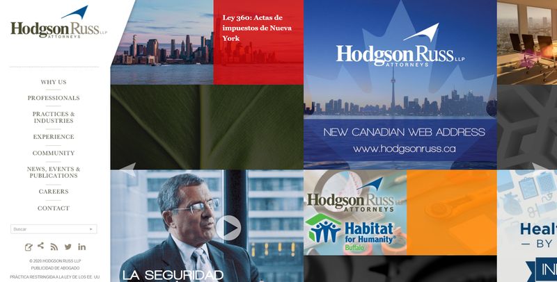
4. Hodgson Russ
Hodgson Russ’s page is totally different from any you’ve seen: the distribution of the information has been done with a huge grid of images and texts, which you can scroll left and right, with a fixed sidebar.
It is a way to show experience and a modern and unique user experience.
5. YLaw Group
If you need an example of how to invest in photographs for your website and that these are well done and cause a different impact, but at the same time serious, the page of this Canadian law firm is what you should keep in mind.

6. Garrigues
Unlike the previous one, Garrigues is a website that is distinguished by two things: the atypical distribution of information and its commitment to typography rather than images and the result, with the color of the brand, is spectacular.

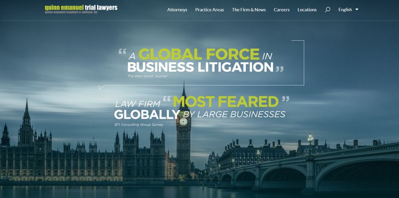
7. Quinn Emanuel Trial Lawyers
The design of this firm is spectacular: an impressive image on the cover with a testimonial of its services from a prestigious client: The Wall Street Journal. Also, it is very easy to find what you are looking for and get in touch with them.
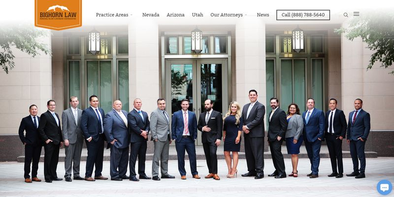
8. Bighorn Law
Again we see a design based on photographs of the team itself to give a human touch and close to its potential customers. What characterizes this website in addition to that are two things: the extensive information and the calculator to create an online budget and that they respect later.
9. Lash & Goldberg
If you do not know English and you browse the page, you would never think that it is a website of a law firm: photographs and minimalism without revealing anything about the subject, but the design is focused precisely on that: the tranquility that hiring them gives.

10. West Coast Trial Lawyers
The novelty here is not so much in the design but in the elements that were prioritized in it: on the cover, they placed a presentation video that you can see by clicking, and in the ratings that the firm has on Yelp, Google, and Avvo (business directories) and a tour of all their awards and achievements.

11. Macfarlanes
This page appears on the list for one reason only: the image and a message are all that you find on the cover and they serve to convey a single and simple message of what they do.

12. Rodriguez Law Group
Rodriguez Law Group has opted for a page that offers you the main things on the first screen with a call to action and an image with the colors of the brand. The page is elegant and reflects the values of the firm, which is why it is on this list.

13. JLongtin Law
This site is minimalist and spectacular at the same time: the huge logo next to the company name and a paragraph that defines who they are and what they do is enough for a striking and spectacular page.
There are no garish images, embellishments, effects, or fonts.

14. Laureti & Associates
The website of this office stands out for its commitment to visual content: the main screen has a video in the background, little used in any field. All the menus and sections are based on custom photos and not the repeated free icons that many websites use.

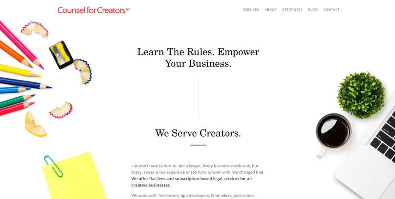
15. Counsel for Creators
An office specialized in digital creators of all kinds must have a design according to the client: that is why the design is more artistic than the rest of the list, with simple but elegant typography and with quality personalized photographs.
16. Egan Nelson
This lawyer also opted for minimalism: the cover has just one message, an image of his logo with a background image. The page, in general, has the same style, and everything works thanks to a very complete and simple menu and it loads very fast.

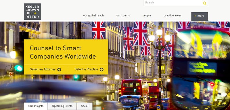
17. Kegler Brown Hill + Ritter
How to use design to send a simple message? In this case, to say to the potential client: “hey, my office operates all over the world”.
Simple: use spectacular images of the cities in which you operate and that are the center of all the design. It is what stands out on this website.
18. Turcs Legal
This Australian website is different because it uses a vertical menu, very little used in any type of website and with high-quality personalized photographs that indicate the most important sections of the website, we have an excellent page.

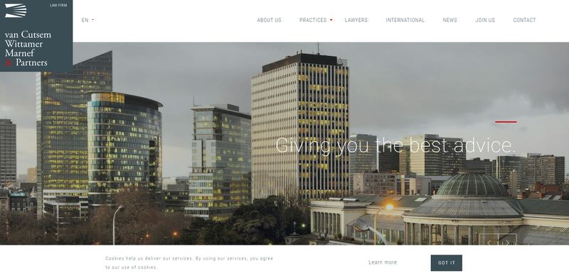
19. Van Cutsem Wittamer Marnef & Partners
If you want to see what a website of serious, institutional law firm should look like, one that reflects the experience and seriousness of your group, you should study the Van Cutsem website well.
The checkered style does not reflect that, but minimalism, order, and ease of reading the information while the style inspires you with seriousness. It’s not garish, but it combines the old-fashioned advocacy elegance with the modern design of 2021.
20. The Law Practice
This site is the perfect combination of sophistication while remaining pleasant at the same time. The design contains many small elements that reflect the care and thought.
The paneled focus on the home page of The Law Practice website makes it extremely easy to follow and the typography is excellent. Their photography is also quite good and helps you feel connected to the team, even before contacting them.

21. Vasil Kisil & Associates
This website is a great example that you don’t need to photograph every site to remain attractive to your potential customer. The colors, structured elements, menu and dynamic animation make this text-based site not yet dominant and easy to navigate.

22. Grette
The Grette website provides a minimalist and branded experience at all times. Subtle design accents allow it to be unique and modern, while portraying a corporate business feel.

Did you like a particular website? Would you like the website of your business to look like one of the websites above? Contact Us: [email protected]/[email protected]